Case Study: Lonely Planet

A Design System
for 6 Apps
Scalable Patterns:
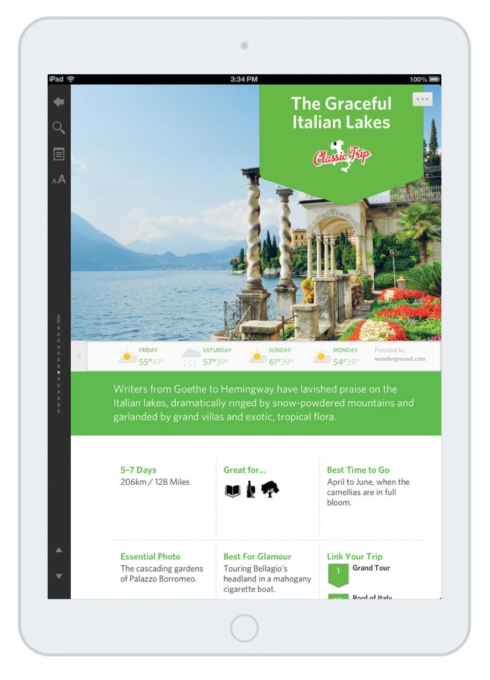
Trips card
The Trips card was the heart of all the content since it provided users with an overview of the trip and ways to dive into other related trips. This card contained a collection of many different patterns such as an introductory header, a weather widget, and a summary section.
Lonely Planet’s Best Trips is a series of six apps built on the Inkling platform and are the first interactive editions of the Best Trips travel guides. Inkling worked with our partners at Lonely Planet to translate their content onto the Inkling platform. We developed new features that brought their printed content to life such as a weather and business location widget, which allowed users to best leverage each guide during research and travel.
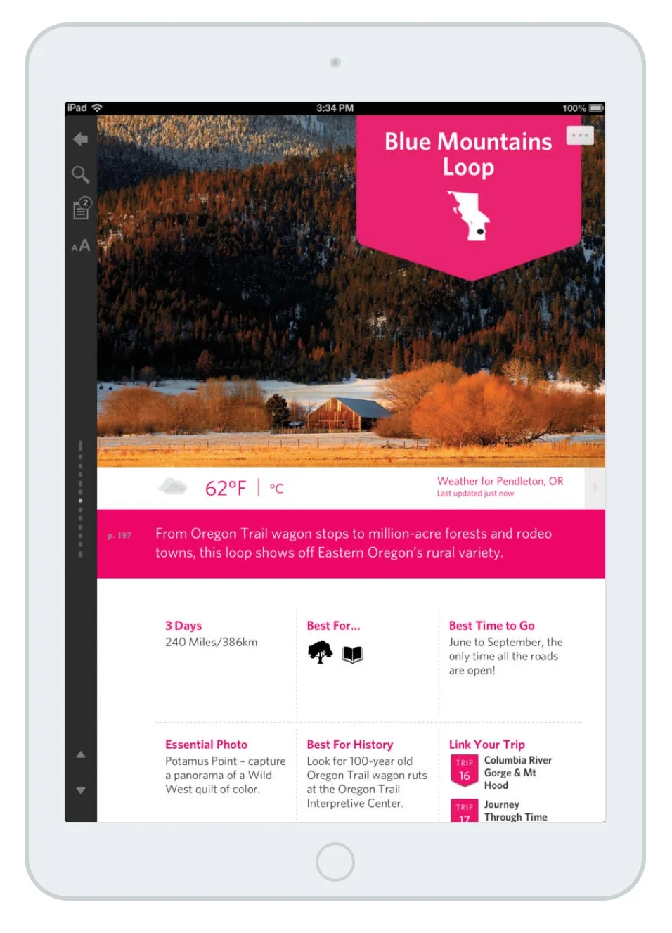
When designing the app, my team had to account for all content patterns. Each app had to feel distinct since they covered different regions and had to fit into a cohesive design system and adhere to the
Lonely Planet brand guidelines.
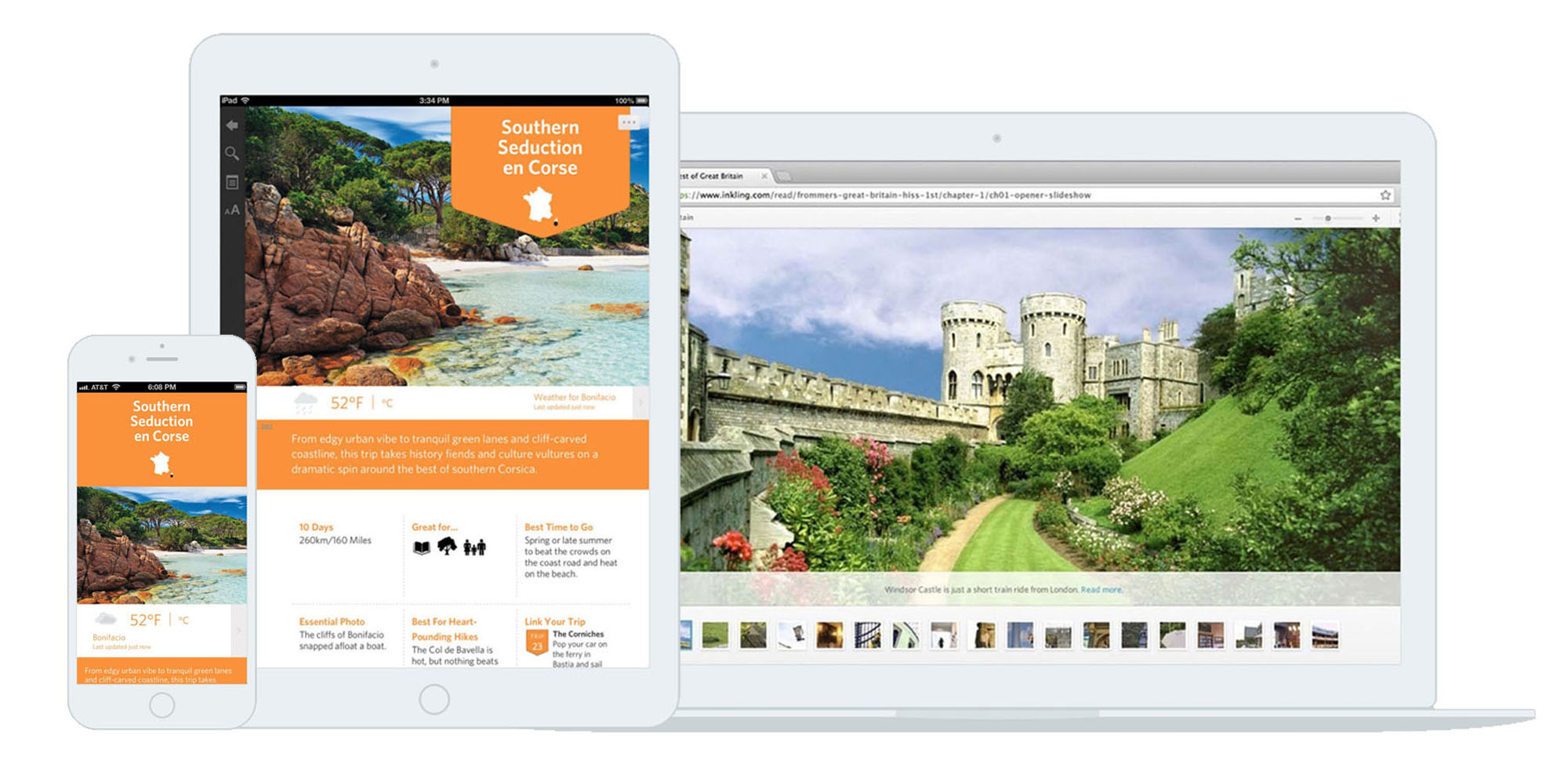
Responsive Patterns
for All Devices
Legibility was extremely important, so my team had to ensure the patterns were designed for an easy read on smaller screen sizes.
Weather widget
Travelers can check on the weather on the web as they read about the day’s activities. Each trip begins with a four-day weather forecast in both Fahrenheit and Celsius.
Interactive Maps
No more flipping back and forth between
the map and the description. Users can
tap through guided tours to see how the suggested trip itineraries map out, or use them to find their next stop while out
on the road.
Business location widget
Businesses change frequently, from hours
of operation to address. The business location widget was designed to give users the most up-to-date information on places recommended by Lonely Planet. Users can see their GPS location relative to the map and tap on relevant information to make
a phone call or visit the business’ website.