Case Study: Inkling

Introducing users to the
Inkling brand
As Inkling began to bring awareness to their young brand, a creative opportunity presented itself to educate users on the variety of content and depth of learning available within the Inkling digital library. The concept is based on the myriad of influences between art and history, poetry and music, science and business and how these overlaps demonstrate interdisciplinary understanding of a subject.
I worked with illustrator Tim Tomkinson.
The compositions were used within digital marketing, P1 and P2 on Inkling.com and user on-boarding flows within product.
Onboarding new users
The Inkling reader had a serious problem. Users were greeted with a lackluster experience upon opening the app for the first time and would subsequently leave because they did not know what else to do with the app. The Inkling 3.1 release sought to change that by introducing an on-boarding experience that would populate the users’ library with books based on categories of interest.

Making a Clear
and Delightful User Flow
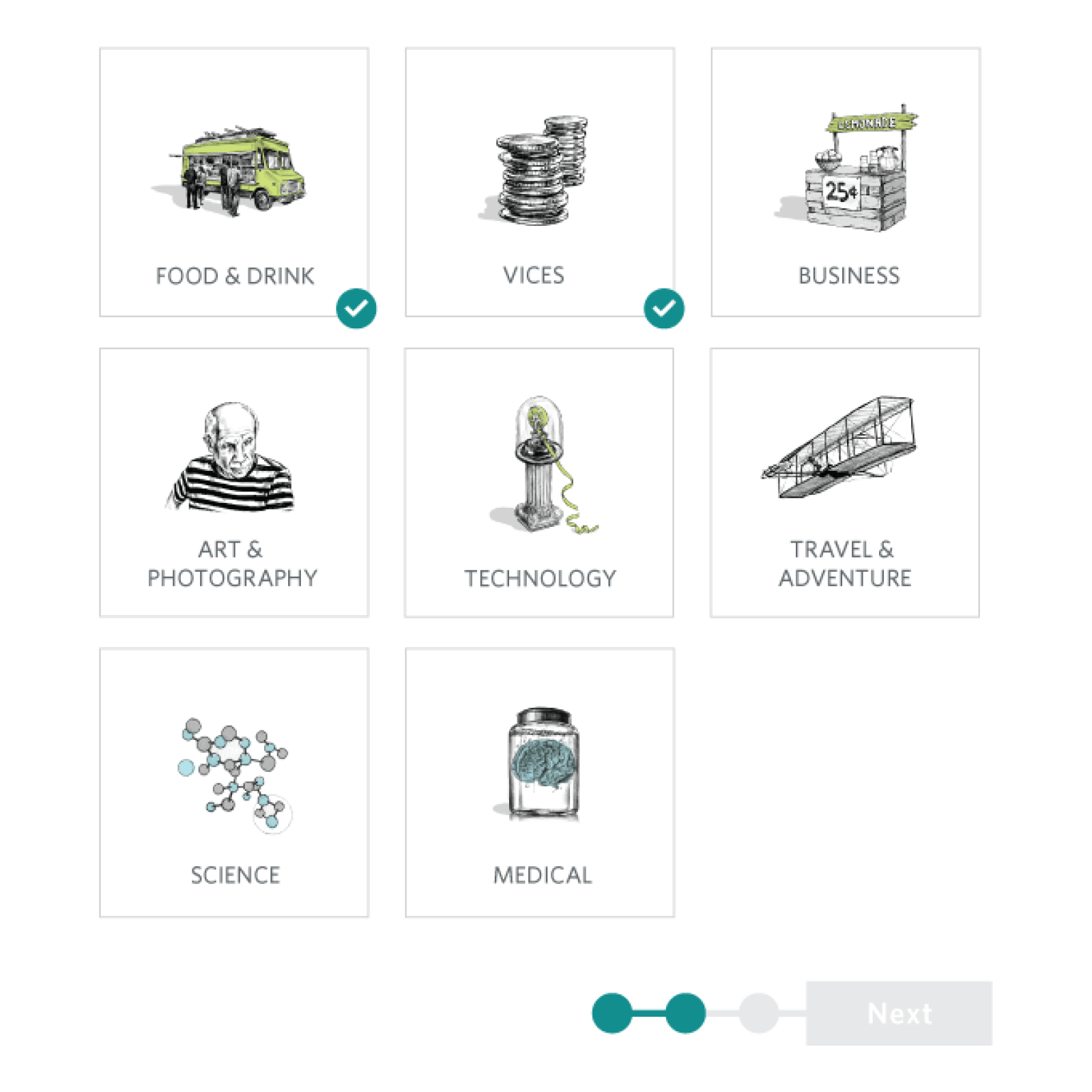
The category selection screen was the biggest component of the on-boarding experience.
The interface incorporated the brand illustrations to add delight to the users' experience and allow for an opportunity to bring branded elements into the product.
As users tap and select each category, the illustrations flip over to reveal whimsical messages pertaining to the subject matter.
We landed on the direction of using Inkling’s brand illustration to give the UI an interesting and varied layout. As users tap and select each category, the illustrations flip over
to reveal whimsical messages pertaining to the subject matter.
Launch sketch v1

Launch sketch v2